Pacific Northwest Seismic Network

What is a Spectrogram?

To view PNSN's seismic spectrograms, go here: Spectrograms.

What is a spectrogram?

A spectrogram is a visual way of representing the signal strength, or “loudness”, of a signal over time at various frequencies present in a particular waveform.  Not only can one see whether there is more or less energy at, for example, 2 Hz vs 10 Hz, but one can also see how energy levels vary over time.  In other sciences spectrograms are commonly used to display frequencies of sound waves produced by humans, machinery, animals, whales, jets, etc., as recorded by microphones.  In the seismic world, spectrograms are increasingly being used to look at frequency content of continuous signals recorded by individual or groups of seismometers to help distinguish and characterize different types of earthquakes or other vibrations in the earth. 

How do you read a spectrogram?

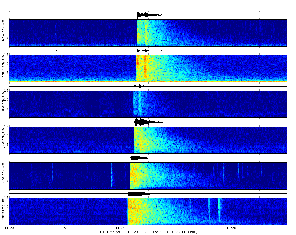
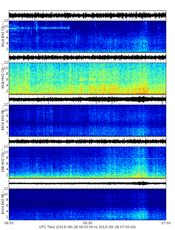
Spectrograms are basically two-dimensional graphs, with a third dimension represented by colors. Time runs from left (oldest) to right (youngest) along the horizontal axis. Each of our volcano and earthquake sub-groups of spectrograms shows 10 minutes of data with the tic marks along the horizontal axis corresponding to 1-minute intervals. The vertical axis represents frequency, which can also be thought of as pitch or tone, with the lowest frequencies at the bottom and the highest frequencies at the top. The amplitude (or energy or “loudness”) of a particular frequency at a particular time is represented by the third dimension, color, with dark blues corresponding to low amplitudes and brighter colors up through red corresponding to progressively stronger (or louder) amplitudes.

Spectrogram example.

Above the spectrogram is the raw seismogram, drawn using the same horizontal time axis as the spectrogram (including the same tick marks), with the vertical axis representing wave amplitude. This plot is analogous to webicorder-style plots (or seismograms) that can be accessed via other parts of our website. Collectively, the spectrogram-seismogram combination is a very powerful visualization tool, as it allows you to see raw waveforms for individual events and also the strength or “loudness” at various frequencies. The frequency content of an event can be very important in determining what produced the signal (see examples).

Why does each spectrogram page show several different spectrograms?

Our spectrogram web pages show groups of spectrograms from multiple stations, usually 5 to 7, with the stations ordered from closest (top of the multi-spectrogram display) to furthest (bottom) relative to a point of interest such as a volcano. Weak seismic sources that originate at or above the surface (wind gusts, animal footsteps, helicopters, thunder, car traffic, etc.) will generally only show up on a single station, whereas stronger sources that occur at or below the earth’s surface (earthquakes, blasts) will generally show up on multiple stations. Showing spectrograms for multiple stations on the same plot allows scientists to quickly determine whether a particular signal is generated by a weak or a strong source and is at the surface or within the earth and therefore distinguish between “noise” (signals from sources in which we usually have no interest) and a signal that is more geophysically significant. Of course the most interesting sources to us are those generated within the Earth such as earthquakes, volcanic eruptions and rock-fall/avalanches.

Interpreting spectrograms

There are three major categories of earthquake that you may see on spectrograms. These are divided according to distance from the seismic network and are traditionally called local (within the Pacific Northwest), regional (near the Pacific Northwest such as from British Columbia, California or offshore) and teleseisms (more than 1,000 kilometers or 600 miles from the Pacific Northwest). Of course there are many types of “noise” signals we record; a few examples are given here. 

Example event types

Spectrogram - Local Earthquakes

From a monitoring perspective, these are the earthquakes in which we are most interested. Local quakes occur within the Pacific Northwest Seismic Network (PNSN) and will usually be located and reported on the PNSN map and list of recent earthquakes. They may be visible on most or all stations within a geographical group as well as stations in other groups. A subset of local earthquakes consists of those that are small and local to only one of the geographical regions such as a volcano group. Volcano related earthquakes may be long-period (LP; with spectral peaks around 1-2 Hz) or volcano-tectonic (VT; with spectral peaks around 2-15 Hz) and may be visible on some or all of the stations in a group but may not appear on other geographic groups. VT earthquakes are a fairly commonly seen type of earthquake near our volcanoes. Their characteristics are the same as regular tectonic earthquakes located anywhere in the Pacific Northwest.  They only indicate volcanic unrest in the very rare cases where they occur in significantly increasing numbers and sizes. LP earthquakes are not common near our volcanoes but when they occur they may be associated with volcanic unrest that could lead to an eruption. However, as often as not, even when there is other evidence for volcanic unrest an eruption is not imminent. Deep LP events usually only mean that a magmatic system is still active and it may be years or many decades before an actual eruption. Unfortunately LP events have characteristic signals to some unrelated seismic sources such as rock-fall, avalanches, quarry blasts and even glacier-generated ice-quakes. It can take an experienced seismic analyst with high-quality seismograms or spectrograms and sophisticated locating techniques to reliably identify true, volcanic, LP earthquakes. Even then, some events showing up on spectrograms defy interpretation or are ambiguous.

Spectrogram example from local earthquake.
Very shallow magnitude 1.2 earthquake under the dome at Mount St. Helens. Note that it shows on all stations with a similar range of frequencies.
Spectrogram example from a local earthquake.
Small, magnitude 0.6 earthquake at 3 km depth beneath Mount St. Helens. Note that this has slightly higher frequency content and shorter duration than the above event. (Stations SUG and SHW show two other, probably very local, unrelated surface sources later in the spectrograms.)


Spectrogram example from a local earthquake.
Very small, magnitude 0.5 earthquake at 5 km depth in northern Puget Sound. Note that this event (may be two of them) only shows up on stations B013, HDW, BLN, the most sensitive stations and closest to the event. (There are three very small local noise events on station B013 and there is a calibration sequence on station JCW.)
Spectrogram example from a local earthquake.
Magnitude 3.3 earthquake near Lake Wenatchee in the eastern Cascades as recorded on the Baker-Glacier set of spectrograms. Note the P- and S-wave on most stations, though station WRW seismogram is saturated for this large, nearby event so the different phases can not be distinguished.

Spectrogram - Regional Earthquakes

These are quakes that occur outside the PNSN area but less than 1,000 km away. These include events from California, British Columbia, Idaho and Montana and from the Juan de Fuca plate offshore. Regional events will usually be recorded by most stations within several geographical areas. Usually two very distinctly different phases (bursts of energy) can be seen from 10s of seconds to two minutes apart. The first phase (P-wave) usually will have a slightly higher frequency content than the second phase (S-wave), which may be stronger. 

Spectrogram example from a regional earthquake.
Magnitude 4.9 earthquake off northern California coast as recorded on the Three-Sisters sub-group.
Spectrogram example from a regional earthquake.
Magnitude 4.9 earthquake off northern California coast as recorded on the Mount St. Helens sub-group. This is the same earthquake as above but recorded farther away. Note that the amplitudes are slightly smaller and the frequency content on average slightly lower. Note the calibration sequence on station, SUG.


Spectrograms - Teleseisms

These are events that occur at large distances from the network (more than 1,000 km). This category therefore includes earthquakes as close as Alaska and as far as Antarctica. The large distance between source and receiver means that only earthquakes exceeding a fairly high magnitude (probably at least Mag=5) will be visible on any spectrograms. The large distance traveled by seismic waves also results in attenuation of high frequencies, so teleseisms have energy only in the low- frequency region. Because of this, our short-period stations (those with extensions “SHZ” or “EHZ”), designed to record energy > 1 Hz, may not see them well. Large earthquakes such as the M9.0 Sumatra earthquake, are visible across all of our networks. These events will show up most clearly on our broadband (extension “BHZ”) stations.

Spectrogram example for a teleseism.
Magnitude 6.8 earthquake in Papua New Guinea at 54 km depth. The above was recorded on the Mount St. Helens volcano sub-group and below on the northern Washington tremor sub-group (NW). Note the very low frequency of the first arrivals with energy only less than 2 Hz.
Spectrogram example for a teleseism.

Spectrograms - Tremor

This type of signal is not a transient signal such as from a single earthquake but is rather a continuous low-frequency signal sometimes observed at volcanoes and more recently during periods of the phenomenon called Episodic Tremor and Slip (ETS) or slow slip (see: Tremor).  The sources for both remain poorly understood, but may be related to sustained pressure fluctuation commonly associated with fluid movement and/or from many very small low-frequency earthquakes occurring in rapid succession.  Tremor at volcanoes is a common precursor to eruptions and often occurs during eruptions, called eruption tremor. Tremor most commonly has spectral peaks between 1-4 Hz, although it may be as high as 10 Hz. It may be continuous for hours to days, or it may start and stop on much shorter time scales (often called “spasmodic tremor”). Tremor associated with ETS periods often varies slightly in amplitude over periods of minutes to tens of minutes.

Because the tremor source is located within the earth, it will be recorded by several or all of the stations in a geographical sub-group (this is partly dependent on signal amplitude and depth). This is a key feature that helps distinguish it from other continuous seismic signals such as that from wind.  

Spectrogram example for tremor.

Above and below are examples of ETS tremor observed on the northern Washington (NW) above and southern Vancouver Island (BC) below sub-groups of stations.  Note that these spectrograms are one hour long and so the tremor takes place and varies in amplitude over several minutes to 10 minutes.

Spectrogram example for tremor.


Below is an example of ETS tremor observed on the Northern California (NC) sub-group of stations.

Spectrogram example for tremor.


Below are examples of volcanic eruption tremor from explosions at Mount St. Helens in 2005.  In the first one note that three stations were destroyed by the explosion and that the eruption has many tiny earthquakes before it starts.  These can merge together to look like tremor at more distant stations.

Station BLIS is destroyed in the second example.  Note that the eruption does not start impulsively (with a bang) but rather gradually builds up over more than a minute.  These spectrograms are NOT from our current working set but was generated from data recorded in 2005 using stations operating at that time.  They are three hours and 30 minutes long rather than the 10 minutes we use now.

Spectrogram example for tremor.

Spectrograms - Wind

A tricky part of seismic monitoring is distinguishing between wind-generated vibrations and seismic signals of geophysical significance such as tremor. Wind may produce low-frequency, continuous noise that looks similar to tremor or it may be broader band with bursts that could mimic and earthquake signal. There are generally two key differences between wind and tremor. First and foremost, tremor is usually observed on most or many of the stations in a geographical sub-group, and the signals change amplitude on all stations at approximately the same time. In contrast, wind may affect only one or a few stations and the variations in amplitudes will not be synchronous between stations. Also, wind-produced seismic signals usually have broadband energy, between 1-15 Hz while tremor is most often confined to the lower frequencies 1-4 Hz.

Spectrogram example from wind.
Gusty wind in the Crater Lake area from a passing storm front. Note that there is energy in the higher frequencies and occurs at different times on different stations.

Spectrograms - Glacier Noise

Because some of our volcanoes have ice cover (Mount Baker, Glacier Peak, Mount Rainier, Mount Adams and Mount Hood), we need to be aware of the seismic signals generated by glacier motions. Seismic events generated by glaciers may occur for a number of reasons: crevassing, slip at the base of a glacier, thermal fracture, serac collapse, etc. Ice-quakes can look very similar to long-period (LP) volcanic earthquakes, with significant energy at frequencies less than 4 Hz. In some cases, ice-quakes show up only on the closest stations (i.e., VALT at Mount St. Helens) while in other cases (such as at Mount Rainier), they may be visible across the whole geographic group. Recently, repeating series of very small ice-quakes at Mount Rainier have been recognized as being triggered by snowstorms. 

Spectrogram example for glacier noise.
A series of medium-large glacier events at Mount Rainier. While the signals look the strongest on OBSR, we know that this station has a very strong response to glacier events which means the sources are not necessarily closer to this station than others.


Spectrogram example for glacier noise.
A series of very small glacier events at Mount Rainier.  Note that most of these show only on the three stations (STAR, RCM and RCS) that are high on the volcano near active glaciers. Station RCS located near the largest and very active glacier (Emmons) usually shows the most such signals.

Spectrograms - Landslides, Rockfalls and Avalanches

Mass-wasting events are another common feature observed, particularly on volcanic seismic networks. These signals have a characteristic appearance in both seismograms and spectrograms. On seismograms, the waveform has a spindle shape with a somewhat gradual onset, and slow decay. The duration of these events is highly variable. Landslide events have very broad spectra; in other words, they have a lot of energy at all frequencies. While most small avalanches and rock-falls will be seen only on a station or two, the largest events will be visible across a geographical sub-group of stations and in rare cases on stations far from the volcano. It is often difficult to distinguish short duration rock-falls from glacier slip events.

Spectrogram example for an avalanche.

Above and below: Several types of surface events at Mount Rainier probably related to, ice-rock avalanches or serac collapse. Note that the larger signals last for tens of seconds with energy concentrated around 2-5 Hz. Note that station WPW, which is located about 18 km east of Mount Rainier shows almost no signal from these surface events. The very short duration, weak events mostly showing only on stations RCM, RCS and STAR are either crevassing events or very small slip events on a glacier. 

Spectrogram example from an avalanche.


Spectrogram example from an avalanche.
A series of large rock fall avalanches at Mount St. Helens. There is a small one starting about 19:11:35 and then two large ones starting at 19:13:05 and 19:17:25. Note the data gap in most channels near the beginning of the first event. 

Spectrograms - Calibration Signals

Among the largest signals that you’ll see on seismograms and spectrograms are the almost daily calibration pulses on many stations. These are automatically-generated signals that report on certain station parameters such as battery voltage and amplification. Because calibration pulses have very strong amplitudes, they usually are very obvious on the recordings but could be mistaken for an earthquake by a careless observer. They occur only on one station at a time. A real earthquake of that amplitude would almost certainly hit all stations in a group.

Spectrogram example from a calibration signal.

Spectrograms - Electronic Noise

There are many signals recorded by seismic stations that are unrelated to “real” Earth processes. These include electronic spikes, cross-talk and telemetry interference associated with instrumentation.  Most of these signals will appear on a single channel. 

Spectrogram example from electronic noise.
There are several examples of instrument noise in this plot. Station WIZ is dead at this time with a nearly flat trace. Spikes on station BBO (with very short bursts showing all frequencies) are due to radio interference. Station J04D has a very narrow band signal at about 10 Hz that is likely due to an instrument resonance. Such single frequency signals can be due to various sources including vibrating parts of the instrument or housing or nearby structures. In some cases, when they are seen to come and go they are thought to be due to nearby motors, generators or even moving water that causes vibrations of equipment or structures. 

Spectrograms - Sonic Signals

There are many sources of vibration of the earth that actually originate from sources in the air, such as sonic booms, thunder or distant artillery. If we were at the seismograph station when such events occurred we would hear them with our ears because they usually contain high (> 20 Hz) sound or acoustic waves. However some of the energy is below our hearing and, if strong enough, will couple into the ground causing seismic waves that the seismograph will record. Sometimes the instrument itself will be shaken by the acoustic waves directly.

Below is a sample 10-minute spectrogram from seismic stations in the Hanford sub-region that have detected the acoustic airwaves from explosions (assumed to be artillery fire) we located in the northern Yakima Firing Range.  They are particularly noticeable on station MD2 and are convincingly acoustic waves by the large time gaps between signals on different stations.  The spectrogram is followed by an image of a seismogram for a much longer period of time in which one can see many such "blips" indicating that practice was going off and on over hours.

Spectrogram example from sonic noise.
Example of acoustic waves from artillery practice on the Yakima Firing Range.
Seismogram example from sonic noise.

While we don't have an example (yet) of a helicopter signal, they may show up on some stations at certain times of year. During field season it is common to see a strong signal that bears resemblance to tremor but occurs only on a single station. This signal is sustained, has an emergent onset and strong amplitude. The spectrum may show a single strong frequency or it may exhibit harmonics. This is the noise produced by a helicopter or even a small, nearby airplane. You may also see scattered high-frequency noise afterwards that is probably due to footsteps near the seismometer. Don’t be surprised if the instrument shuts off afterwards; It’s just maintenance. Using seismograms and spectrograms for such "detective" work can be a nice diversion for the professional seismic analyst from routine processing of earthquakes.

During the summer, thunderstorms are common over the mountains. Seismic signals from thunder shaking the ground can easily be confused with more interesting sources such as avalanches or even earthquakes. Because sound waves in the air travel much slower than vibrations in the ground, the signals from thunder will be spread out over more time than vibration sources originating in or on the earth. When in doubt, we also check with the weather service for known storm activity in the area.