Slowly unzipping fault seen offshore
A paper this month (Jeff McGuire et al., Nature Geoscience, 5, 336-341, 2012) shows a fascinating progression of fault failure, providing a new clue as to how indications of activity precursory to large earthquakes might appear. The observation comes from the Gofar transform fault, which is on the East Pacific Rise offshore central America.
The first figure (click on it to see a bigger version) is topography on the left, accompanied by a simple cartoon of the tectonics and a more accurate cartoon. The fault is a transform, which means it has strike-slip earthquakes, and rather than break all at once, tends to have magnitude 6 earthquakes on the orange patches and intense swarms of earthquakes on the red patch.
The timing of the M6 earthquakes in the two locations is shown by the red and yellow dots on the timeline of earthquakes in the region below. The timeline shows that the M6 events on the two segments occur close in time, and each break roughly every four years. Noticing the pattern, McGuire put a set of seismometers on the ocean floor at the right time to neatly capture the 2007-2008 sequence of earthquakes. The interesting part comes between the 2007 yellow dot and the 2008 red dot, specifically in the week before the 2008 M6 earthquake.
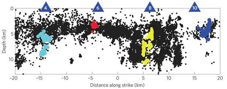
The third figure shows a cross-section of the seismicity in the region of the two M6 earthquakes. The red and dark blue dots (below the blue triangles with the numbers 6 and 10) are in the locations of the two orange semi-circles above - those are the patches of fault that break in M6 earthquakes, with red here corresponding to red in the timeline and dark blue corresponding to yellow in the timeline (sorry about the inconsistent color scheme).
Swarms have been seen prior to earthquakes before, that is not the new part of this observation, but the details of this swarm are cool. Apparently, after the blue patch failed in an M6 in 2007, fault movement began on the swarm area (triangle 8, around the yellow dots), and intensified in the week before the M6 around the red patch. The properties of the rock in the yellow patch changed noticeably - the seismic wavespeed decreased by 3% - during the week of activity. The interpretation is that the swarm area has the unforeseen properties in that it (1) takes a week to yield, (2) it yields until the neighboring fault patch breaks, and (3) we can tell that significant yielding is occurring by monitoring the temporal change in seismic wavespeed. Further, we can try to figure out from the observed changes in the physical properties of the fault what allows this stretch of fault to display such well-mannered behavior.
The swarm extends much deeper than the M6 events are inferred to have broken, and the fluctuation in seismic wavespeed is inferred to show that myriad tiny cracks are opening during the week-long burst of strain, perhaps enhancing fluid flow to facilitate redistribution of fluid pressures.
This is still a scientific work in progress. First, we need to figure out how universal is the presence of faults patches that reveal their yielding in such observable ways. Second, I hope Jeff is ready to look more closely at the next iteration of this sequence in 2012 (or maybe 2016?) to get a sharper picture of the action so we better know how to look for it elsewhere.


